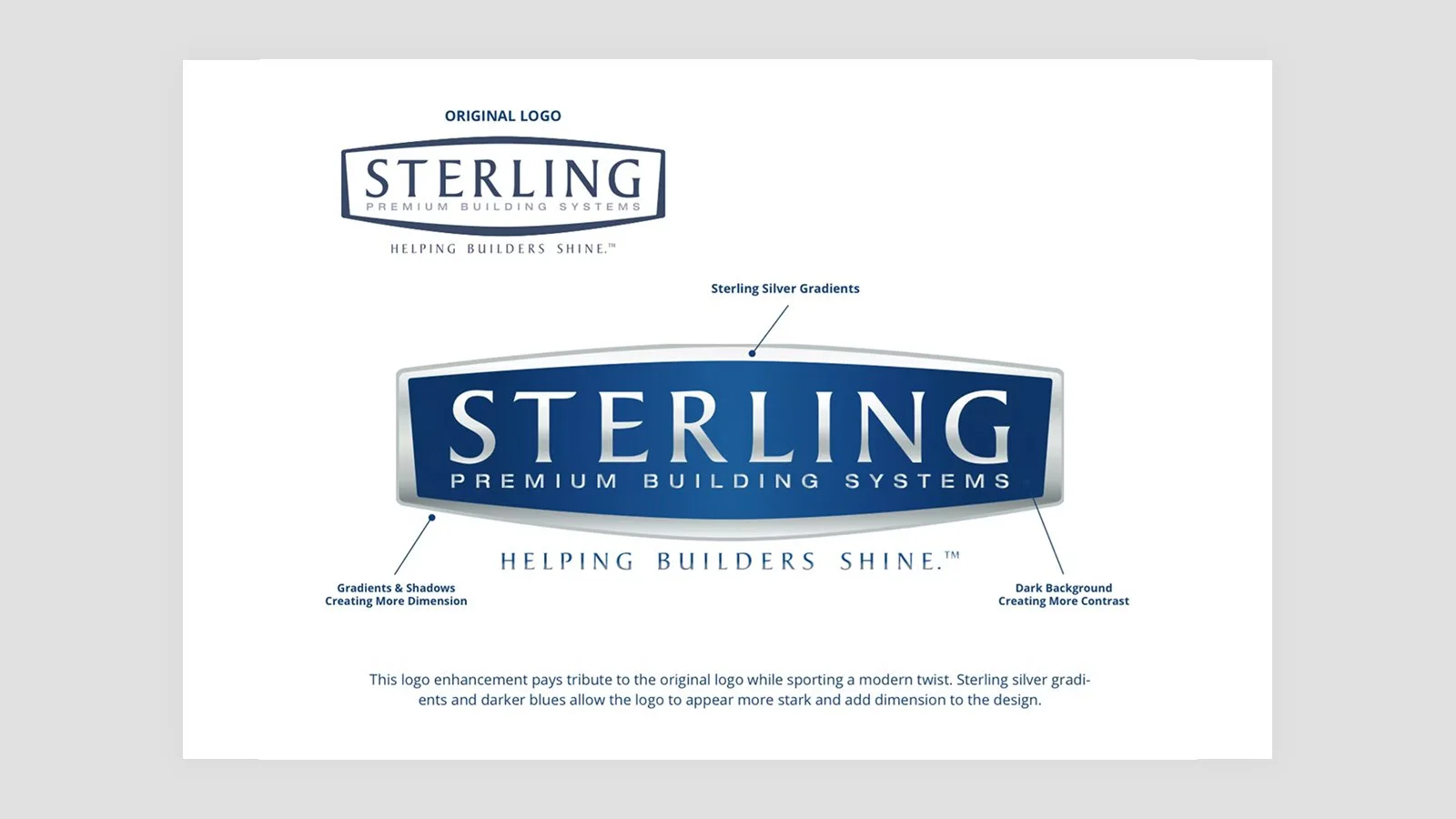
Sterling Premium Building Systems Logo Redesign
Sterling Premium Building Systems, a trusted name in construction for over 60 years, needed a refreshed logo that honored their legacy while bringing a modern edge. While the original mark lacked depth and versatility, the redesigned logo introduced gradients, shadows, and a bold background for enhanced contrast, improving both visual impact and accessibility. Additional brand assets were developed, including business cards, pamphlets, and website graphics to support a unified visual identity.


